── Attaching core tidyverse packages ──────────────────────── tidyverse 2.0.0 ──
✔ dplyr     1.1.4     ✔ readr     2.1.5
✔ forcats   1.0.1     ✔ stringr   1.5.2
✔ ggplot2   4.0.0     ✔ tibble    3.3.0
✔ lubridate 1.9.4     ✔ tidyr     1.3.1
✔ purrr     1.1.0
── Conflicts ────────────────────────────────────────── tidyverse_conflicts() ──
✖ dplyr::filter() masks stats::filter()
✖ dplyr::lag()    masks stats::lag()
ℹ Use the conflicted package (<http://conflicted.r-lib.org/>) to force all conflicts to become errors
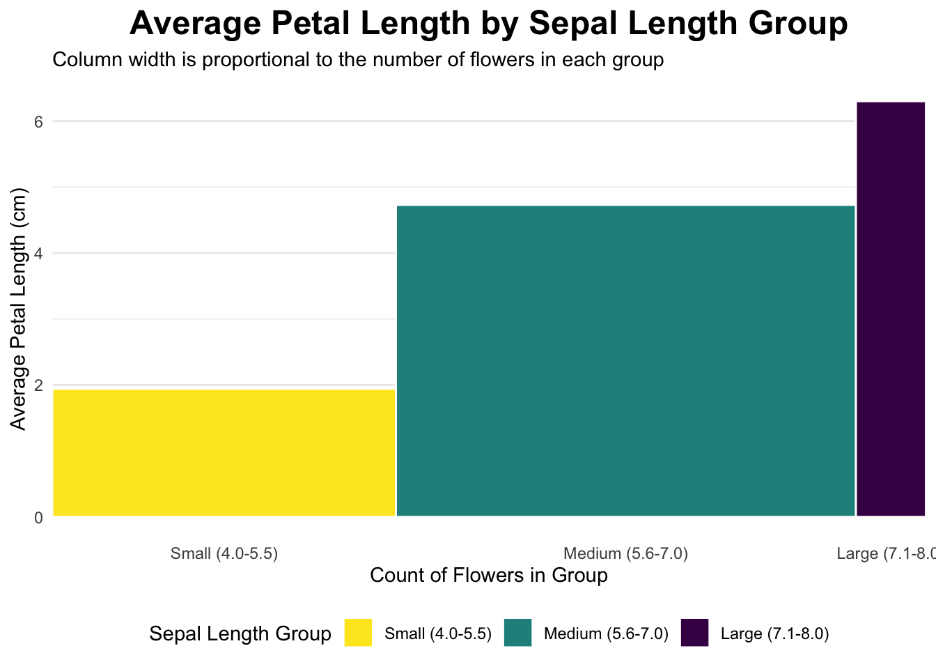
# 1. Divide the dataset into three rectangles based on species.# The average of Petal.Length and Petal.Width is the length and width.# Draw three rectangles arranged horizontally.#1plot_data <- iris %>%mutate(sepal_length_group =cut( Sepal.Length,breaks =c(4, 5.5, 7.0, 8.0),labels =c("Small (4.0-5.5)", "Medium (5.6-7.0)", "Large (7.1-8.0)"),include.lowest =TRUE ) ) %>%group_by(sepal_length_group) %>%summarise(count =n(),avg_petal_length =mean(Petal.Length) ) %>%mutate(xmax =cumsum(count),xmin = xmax - count,x_label_pos = (xmin + xmax) /2 )ggplot(plot_data, aes(ymin =0)) +geom_rect(aes(xmin = xmin,xmax = xmax,ymax = avg_petal_length,fill = sepal_length_group ),color ="white" ) +scale_x_continuous(breaks = plot_data$x_label_pos,labels = plot_data$sepal_length_group,expand =c(0, 0) ) +scale_fill_viridis_d(option ="D", direction =-1) +labs(title ="Average Petal Length by Sepal Length Group",subtitle ="Column width is proportional to the number of flowers in each group",x ="Count of Flowers in Group",y ="Average Petal Length (cm)",fill ="Sepal Length Group" ) +# Apply a clean themetheme_minimal() +theme(plot.title =element_text(hjust =0.5, face ="bold", size =18),legend.position ="bottom",panel.grid.major.x =element_blank(), # Remove vertical grid linespanel.grid.minor.x =element_blank() )
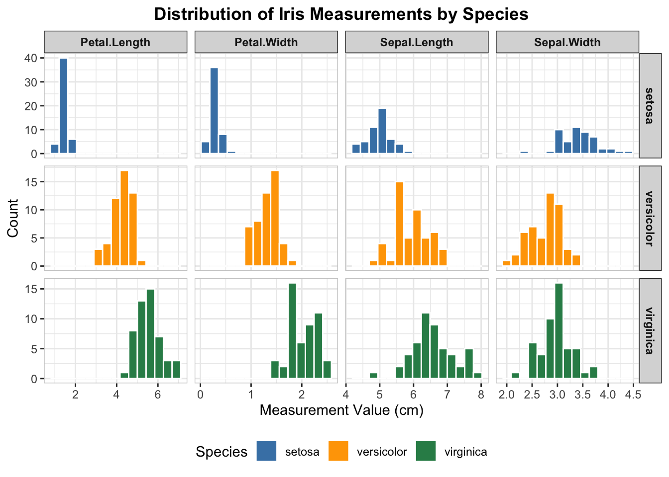
# 2. table with embedded chartsiris_long <- iris %>%pivot_longer(cols =-Species, names_to ="Measurement", values_to ="Value")ggplot(iris_long, aes(x = Value, fill = Species)) +geom_histogram(color ="white", bins =15) +facet_grid(Species ~ Measurement, scales ="free") +scale_fill_manual( #coloring each speciesvalues =c("setosa"="steelblue", "versicolor"="orange", "virginica"="seagreen" ) ) +#labelslabs(title ="Distribution of Iris Measurements by Species",x ="Measurement Value (cm)",y ="Count" ) +theme_bw() +theme(plot.title =element_text(hjust =0.5, face ="bold"),strip.text.x =element_text(face ="bold"),strip.text.y =element_text(face ="bold"),panel.border =element_rect(color ="grey80", fill =NA),legend.position ="bottom" )
# 3. Extract setona and versicolor from species.# Then create df_2 and df_3. Draw a bar plot using petal.width: p1 p2.# Finally, use gridExtra to combine the plots.'library("gridExtra")
Attaching package: 'gridExtra'
The following object is masked from 'package:dplyr':

    combine
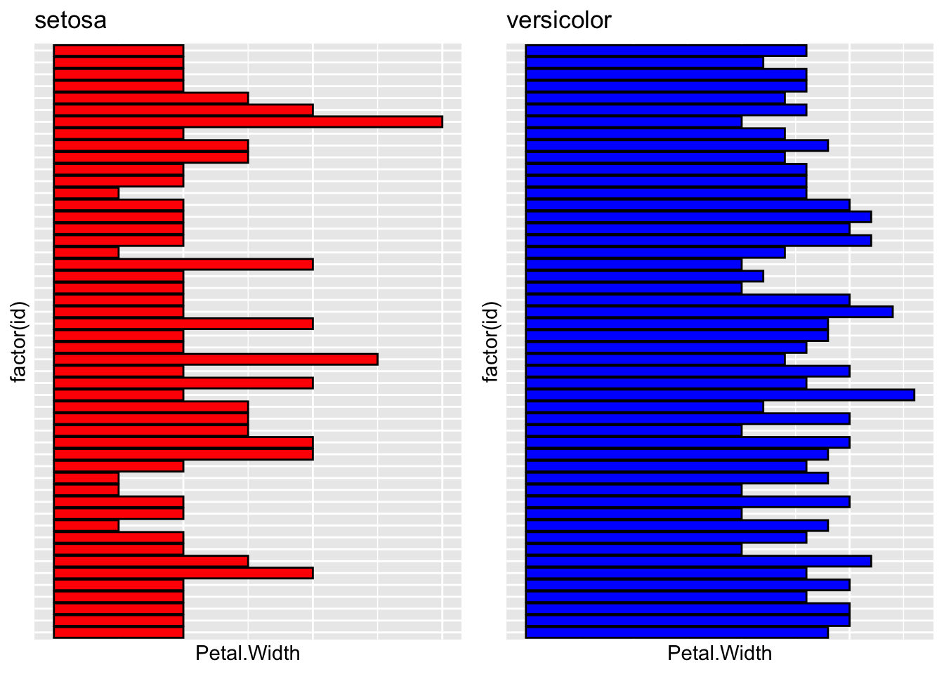
df_2 <-subset(iris, Species %in%"setosa")df_3 <-subset(iris, Species %in%"versicolor")df_2$id <-1:nrow(df_2)df_3$id <-1:nrow(df_3)p1 =ggplot(df_2, aes(x =factor(id), y = Petal.Width)) +geom_bar(stat ="identity", fill ='red', color ="black") +coord_flip() +labs(title ="setosa") +theme(axis.text.y =element_blank(),axis.ticks.y =element_blank(),axis.text.x =element_blank(),axis.ticks.x =element_blank() #this was by GPT )p2 =ggplot(df_3, aes(x =factor(id), y = Petal.Width)) +geom_bar(stat ="identity", fill ="blue", color ="black") +coord_flip() +labs(title ="versicolor")+theme(axis.text.y =element_blank(),axis.ticks.y =element_blank(),axis.text.x =element_blank(),axis.ticks.x =element_blank() #this was by GPT )gridExtra::grid.arrange(p1, p2, ncol =2)
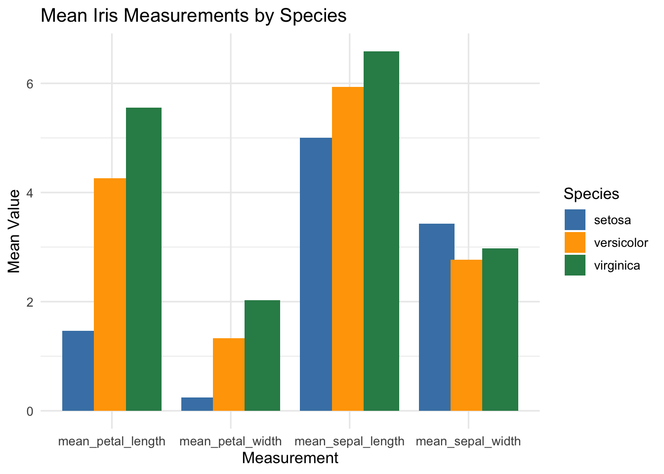
# 4 Column Chart# getting means of Petal length and width for each species# and mean sepal length and sepal widthiris_means <- iris %>%group_by(Species) %>%summarise(mean_sepal_length =mean(Sepal.Length),mean_sepal_width =mean(Sepal.Width),mean_petal_length =mean(Petal.Length),mean_petal_width =mean(Petal.Width) ) %>%pivot_longer(cols =-Species,names_to ="Measurement",values_to ="MeanValue" )ggplot(iris_means, aes(x = Measurement, y = MeanValue, fill = Species)) +geom_col(position =position_dodge(width =0.8)) +labs(title ="Mean Iris Measurements by Species",x ="Measurement", y ="Mean Value") +theme_minimal(base_size =12) +scale_fill_manual(values =c("steelblue", "orange", "seagreen"))
Class coding competition
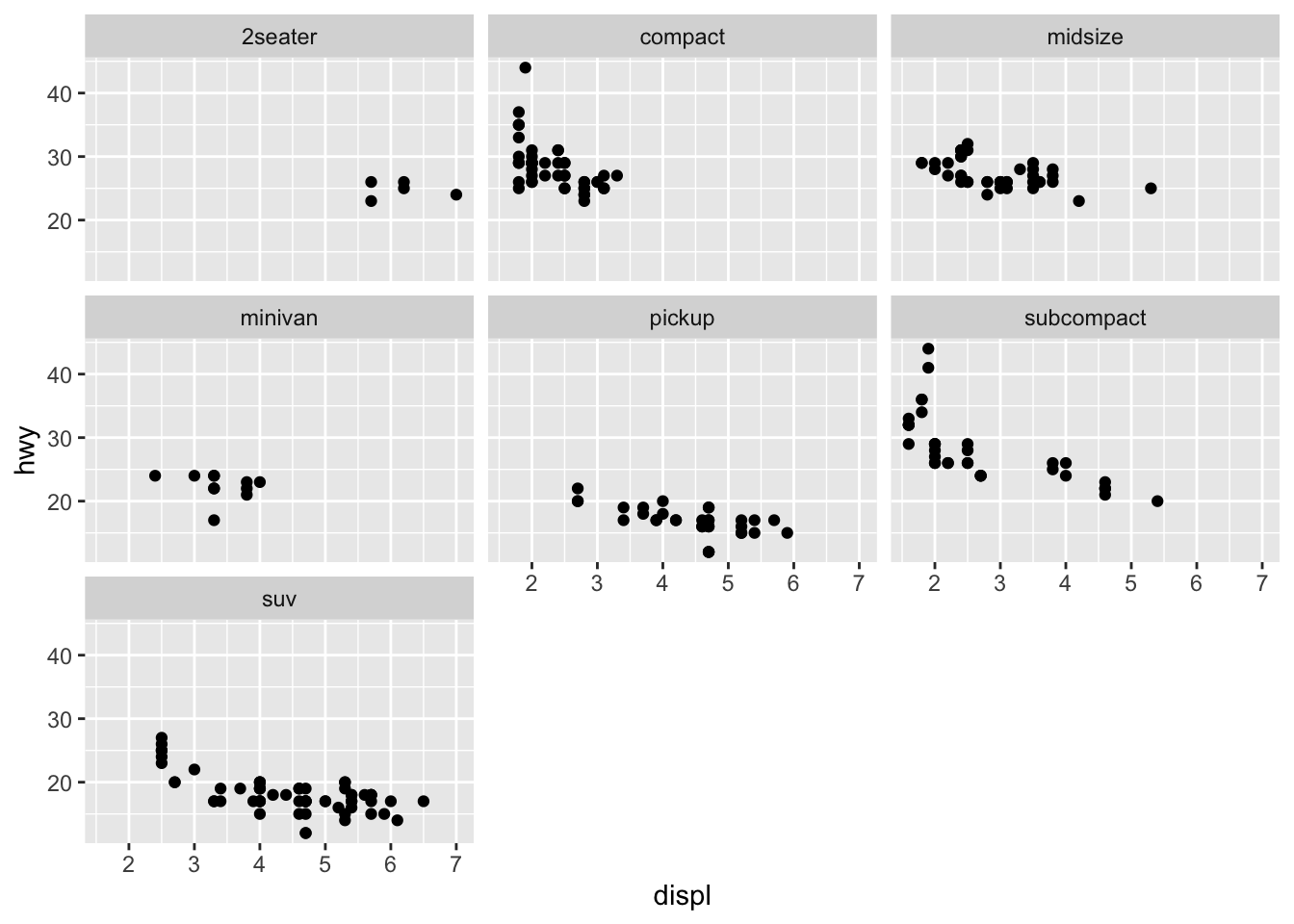
library(ggplot2)mpg <-as.data.frame(mpg)#2seater, compact, midsize, minivan, pickup, subcompact, suv scatterplots in one viewggplot(mpg, aes(x=displ, y=hwy)) +geom_point(color ="black") +facet_wrap(~ class) +labs(x="displ",y="hwy") +theme_gray()
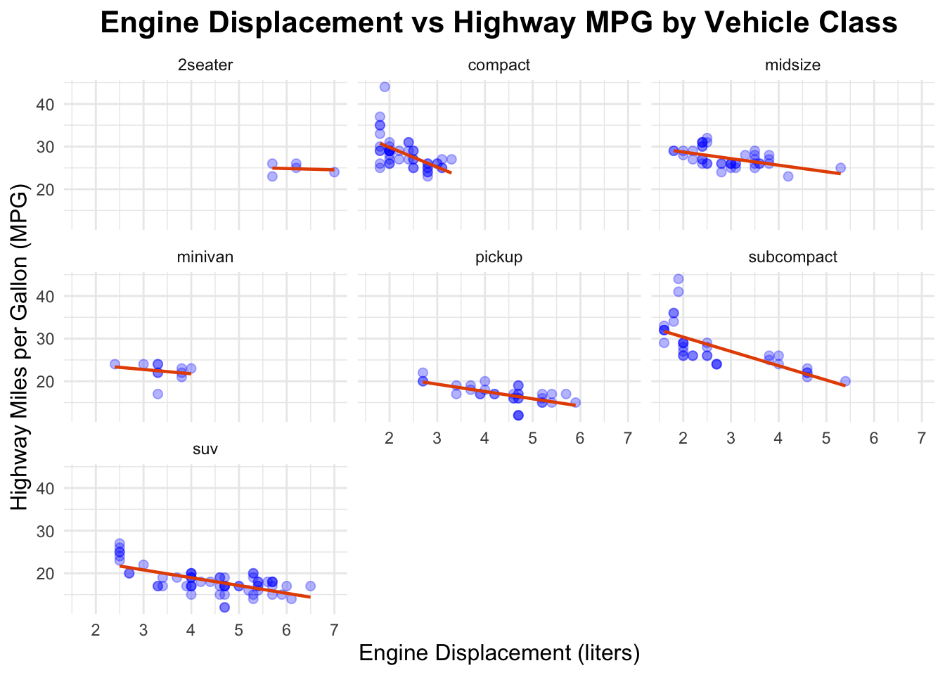
#improving the chartggplot(mpg, aes(x=displ, y=hwy)) +geom_point(color ="blue", size=2, alpha=0.3) +geom_smooth(method ="lm", se =FALSE, color ="#E65100", linewidth =0.8) +facet_wrap(~ class) +labs(title="Engine Displacement vs Highway MPG by Vehicle Class",x="Engine Displacement (liters)",y="Highway Miles per Gallon (MPG)") +theme_minimal() +theme(plot.title =element_text(hjust =0.5, size=16, face="bold"),axis.title.x =element_text(size=12),axis.title.y =element_text(size=12) )
`geom_smooth()` using formula = 'y ~ x'
Assignment 5
# GPT was used for picking colors and family.# GPT was used for adjusting the format of the code.library(ggplot2)library(scales) # for alpha()
Attaching package: 'scales'
The following object is masked from 'package:purrr':

    discard
The following object is masked from 'package:readr':

    col_factor
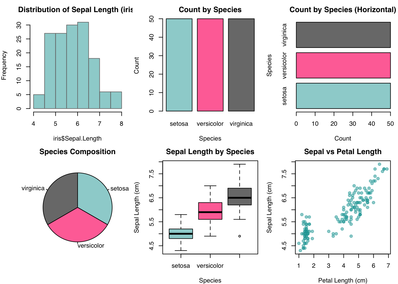
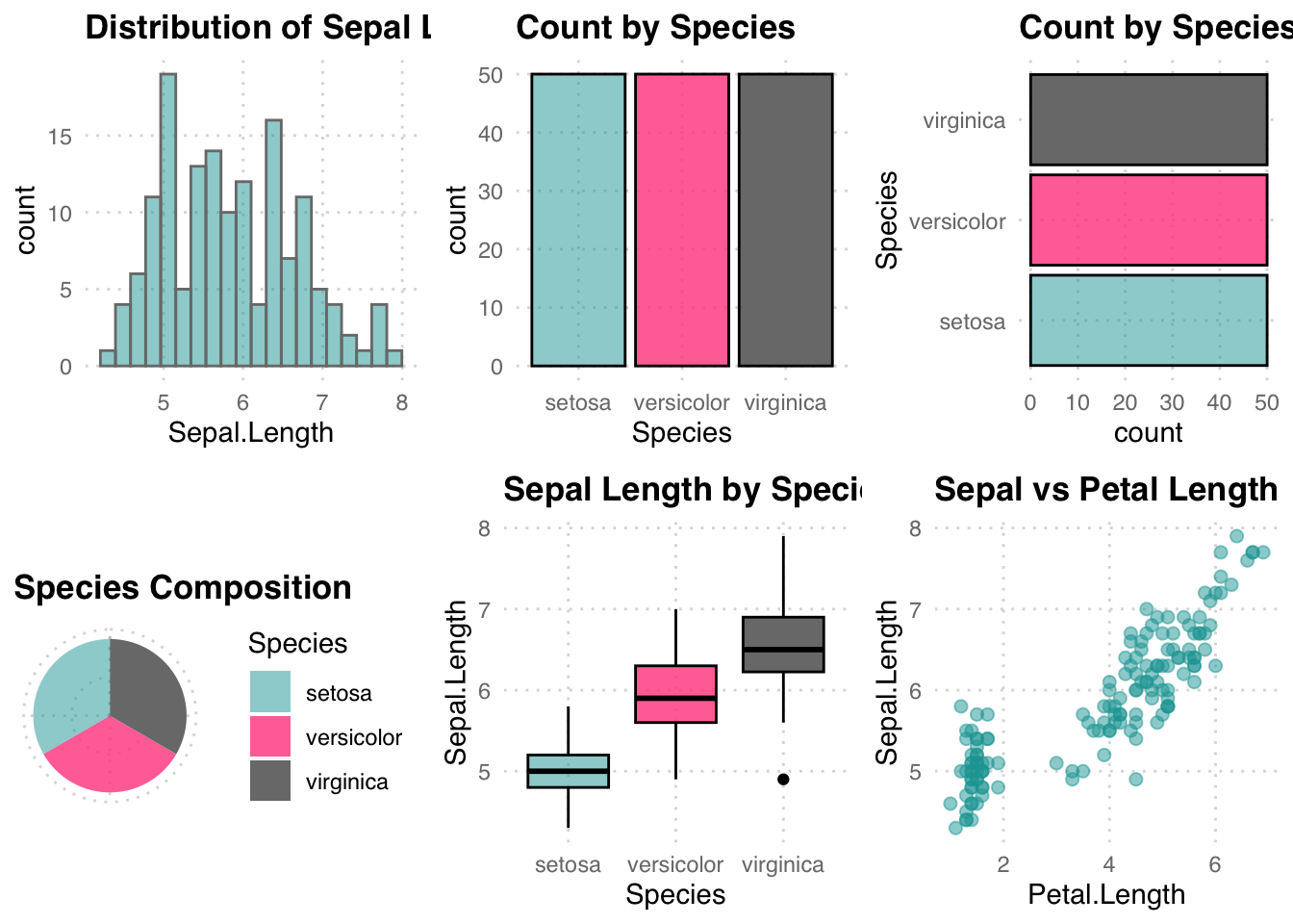
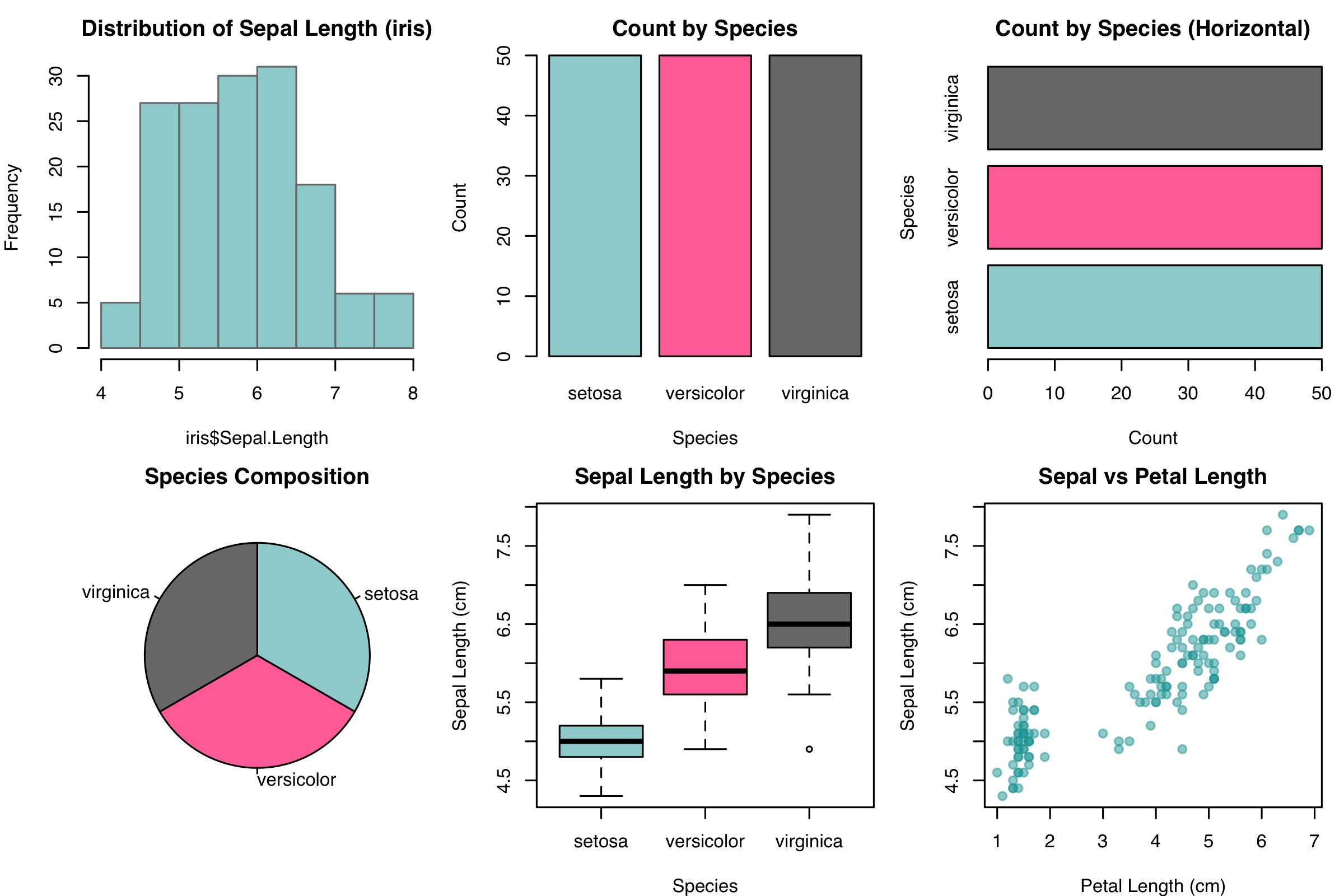
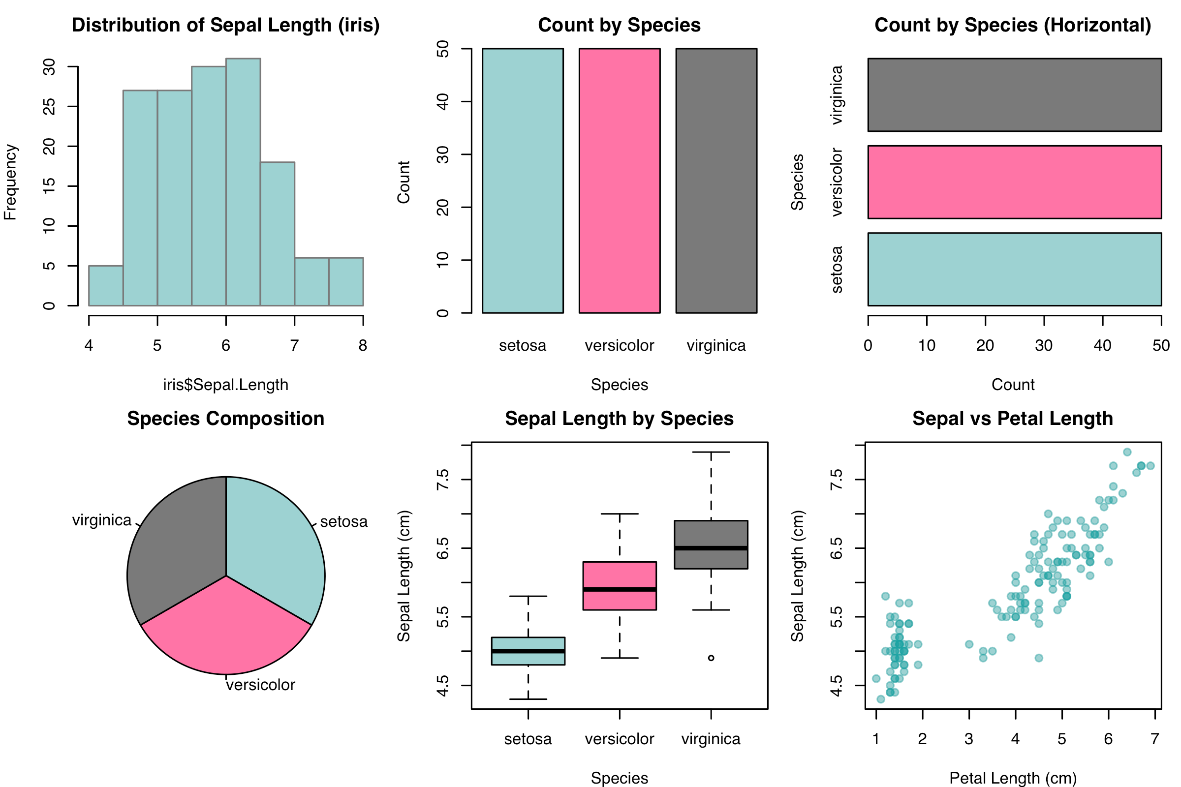
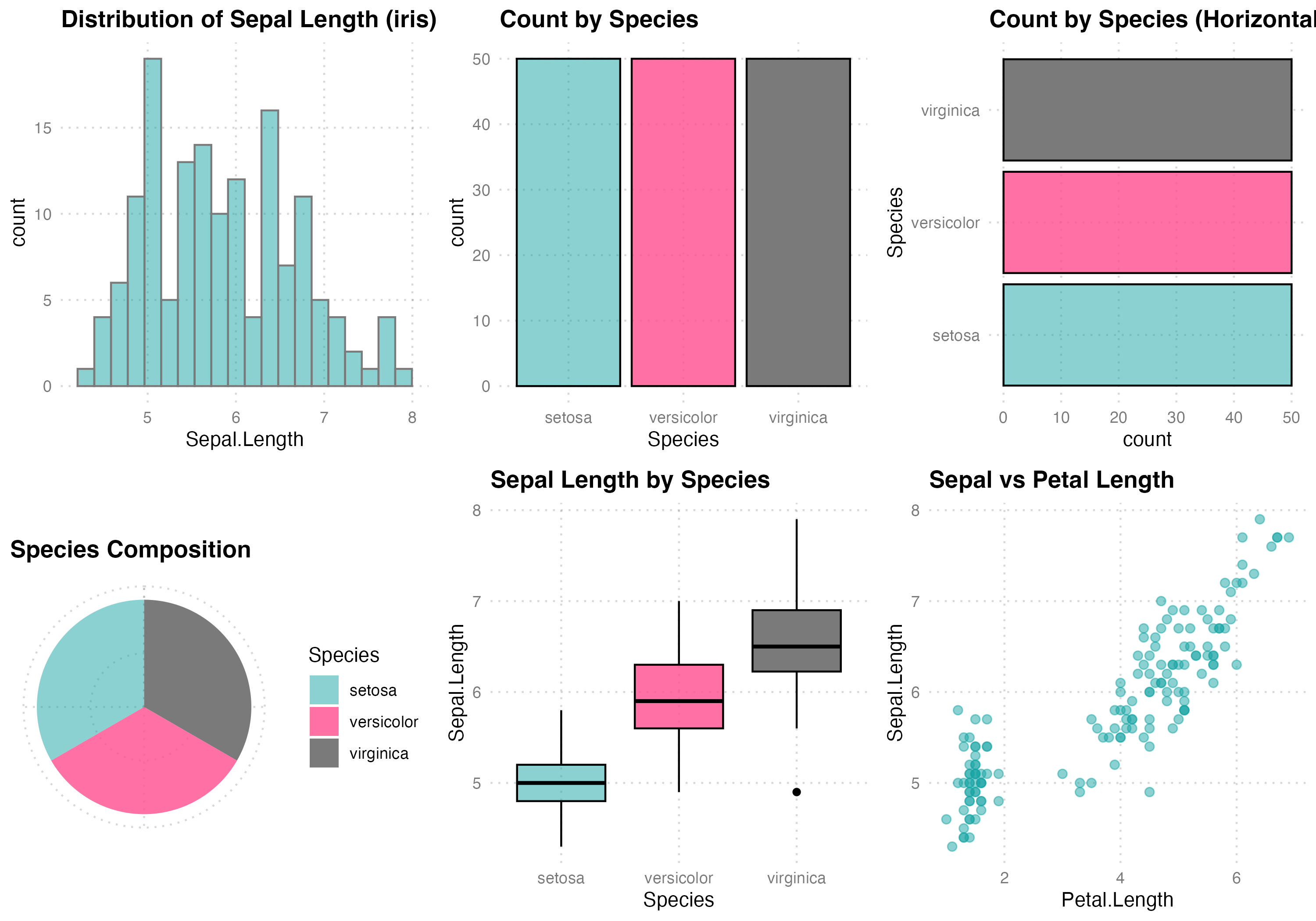
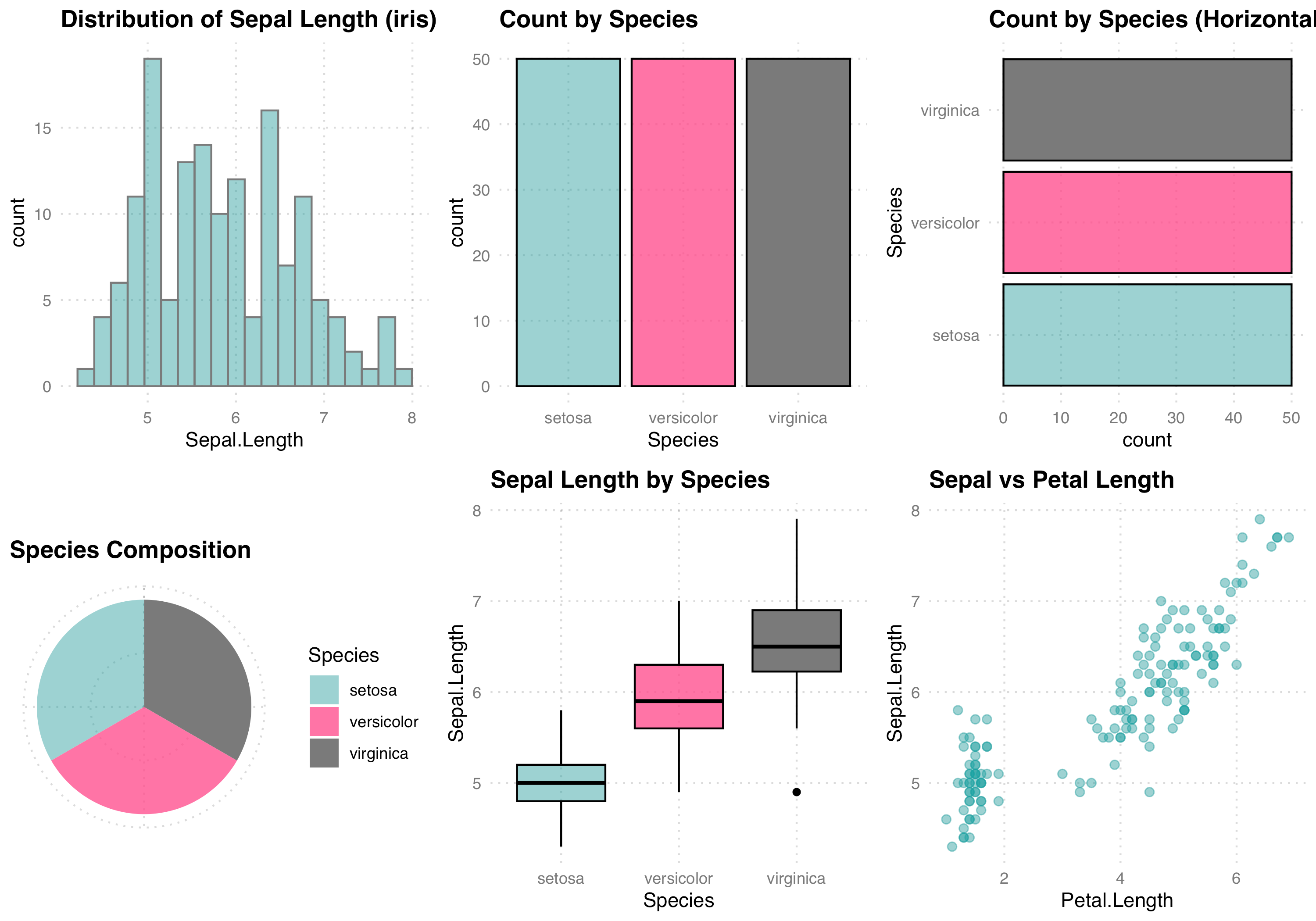
data(iris)color1 <-"#18A3A380"color2 <-"#FF4D8DCC"color3 <-"#7A7A7A"color4 <-"#000000"base_family <-"sans"# custom theme used across plotstheme1 <-function() {theme_minimal(base_family = base_family) +theme(text =element_text(family = base_family, colour = color4),plot.title =element_text(face ="bold", colour = color4, size =13),axis.title =element_text(colour = color4),axis.text =element_text(colour = color3),panel.grid.major =element_line(color = scales::alpha(color3, 0.3), linetype ="dotted"),panel.grid.minor =element_blank() )}Histo <-function(){hist(iris$Sepal.Length,main="Distribution of Sepal Length (iris)",col=color1, border=color3)}Bar1 <-function(){barplot(table(iris$Species),col=c(color1,color2,color3),border=color4,main="Count by Species",xlab="Species", ylab="Count")}Bar2 <-function(){barplot(table(iris$Species),horiz=TRUE,col=c(color1,color2,color3),border=color4,main="Count by Species (Horizontal)",xlab="Count", ylab="Species")}Pie <-function(){pie(table(iris$Species),col=c(color1,color2,color3),main="Species Composition",clockwise=TRUE)}Box <-function(){boxplot(Sepal.Length~Species, data=iris,col=c(color1,color2,color3),main="Sepal Length by Species",xlab="Species", ylab="Sepal Length (cm)")}Scat <-function(){plot(iris$Petal.Length, iris$Sepal.Length,main="Sepal vs Petal Length",xlab="Petal Length (cm)", ylab="Sepal Length (cm)",pch=19, col=color1)}